Rebranding gifts

Rebranding gifts read as one brand only when a single new master mark holds identical across every item, not as three brands drifting between a tee, a bottle and a pen. We run your rebrand rollout from one master file, Pantone-locked and version-controlled, so your new logo lands the same on every line. This hub is the decision layer above the product pages, built for a whole-range rebrand across apparel, drinkware, tech, stationery and bags.
FILTER
SORT
  • Price, low to high
  • Price, high to low
1034 products
  • Eco-friendly
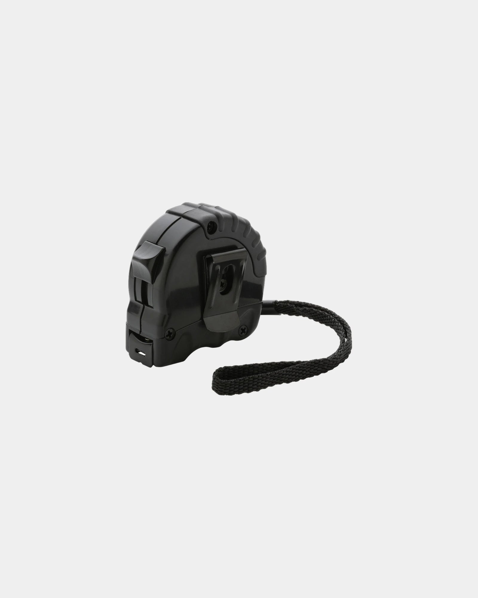
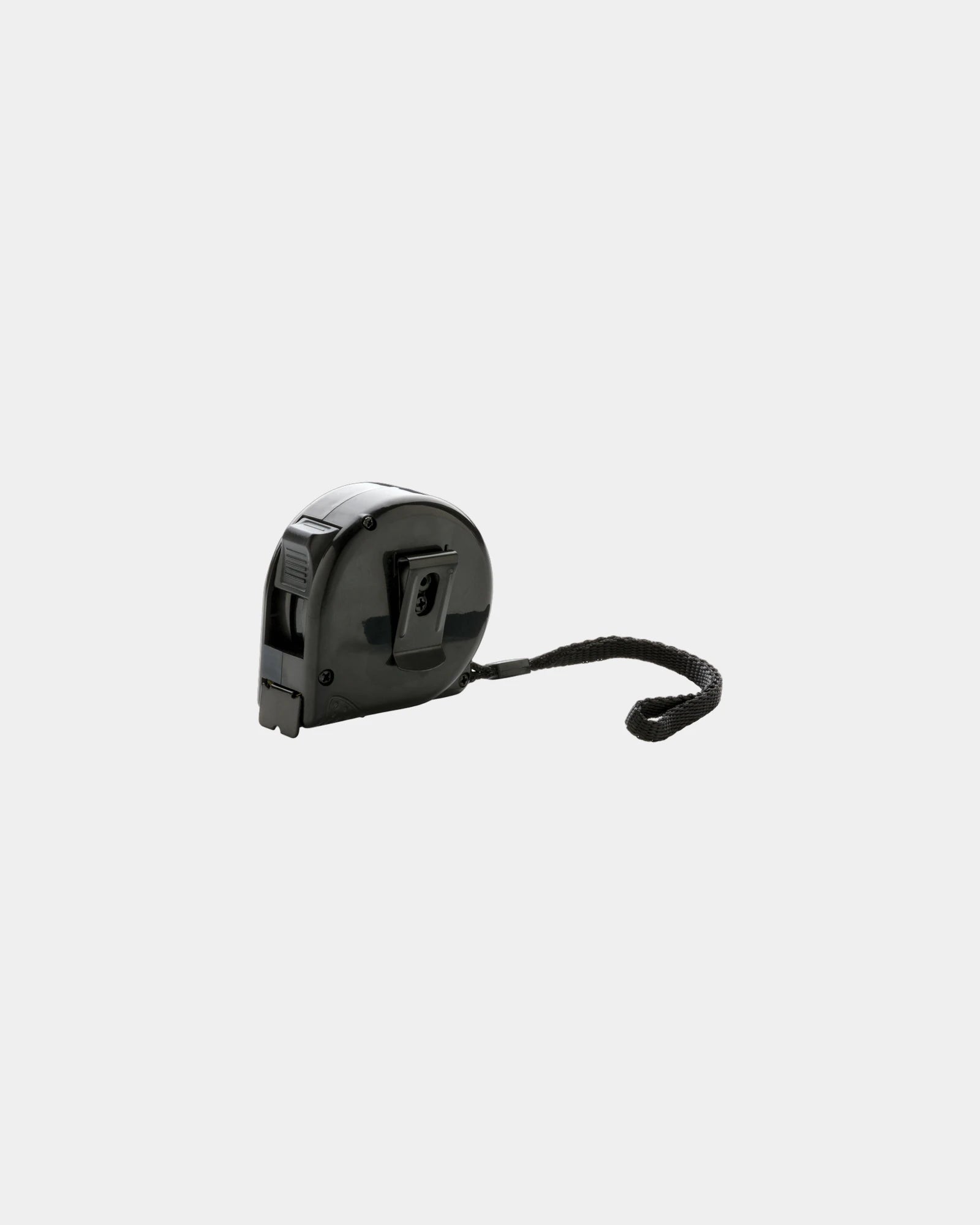
Promotional recycled ABS tape measure 3M 16mm - 1Promotional recycled ABS tape measure 3M 16mm - Black
Starting from £3
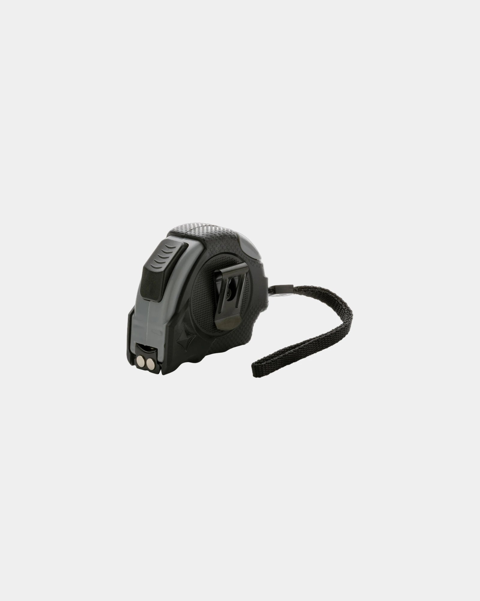
Promotional compact ABS tape measure 5m 19mm - 1Promotional compact ABS tape measure 5m 19mm - Black
Starting from £3
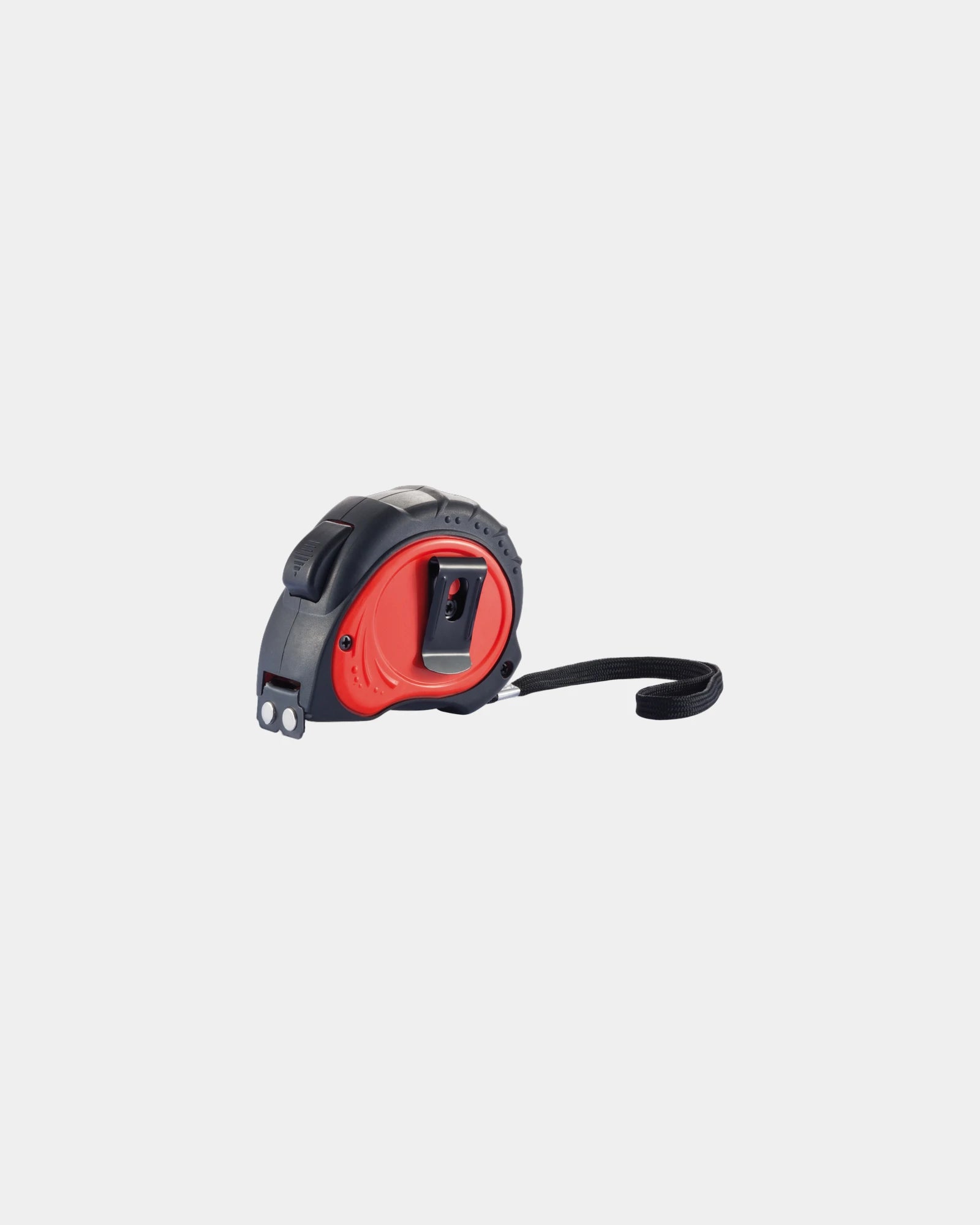
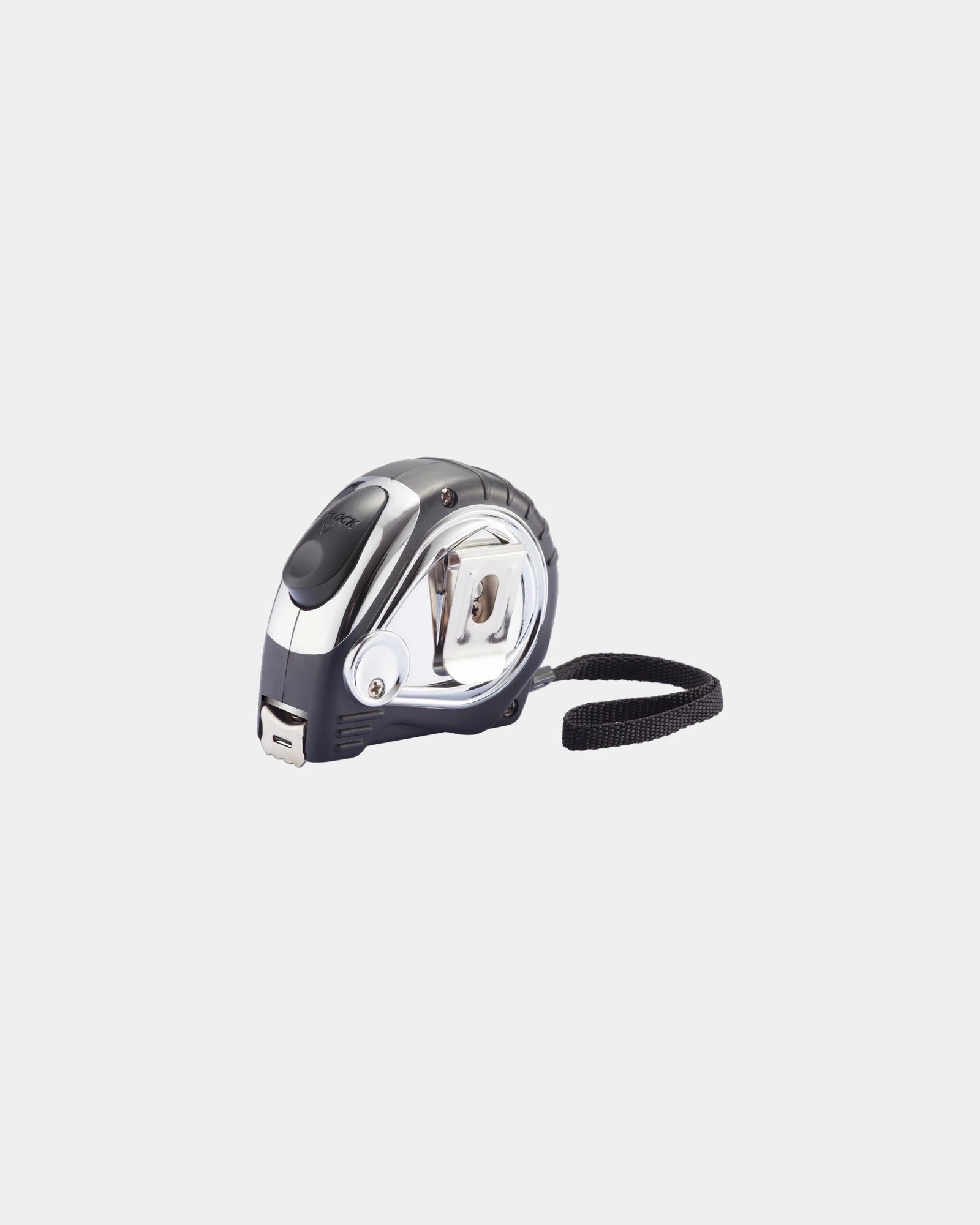
Promotional Tool Pro 5m measuring tape - 1Promotional Tool Pro 5m measuring tape - Red
Starting from £5
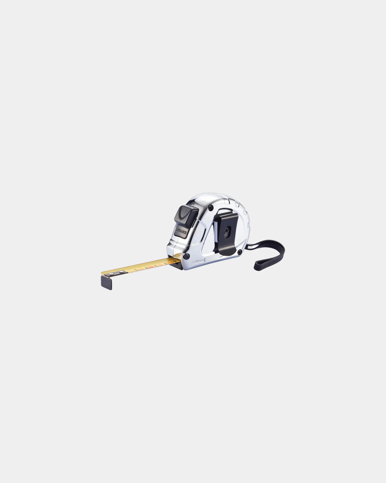
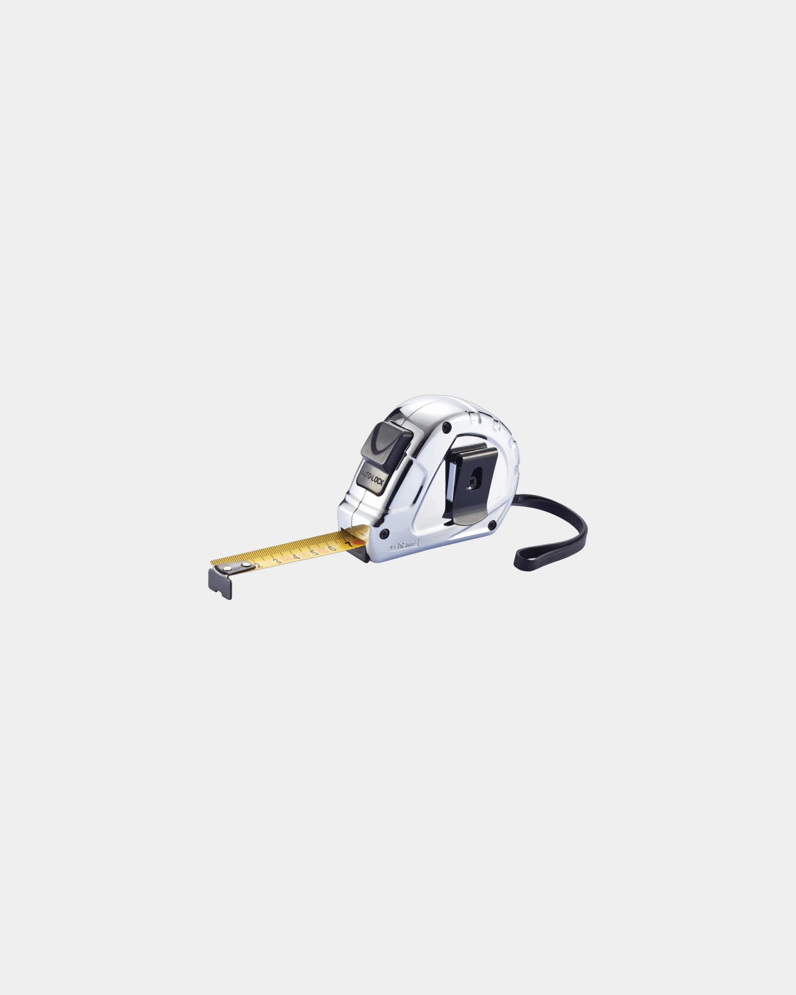
Promotional 5m/19mm ABS tape measure - 1Promotional 5m/19mm ABS tape measure - Silver
Starting from £5
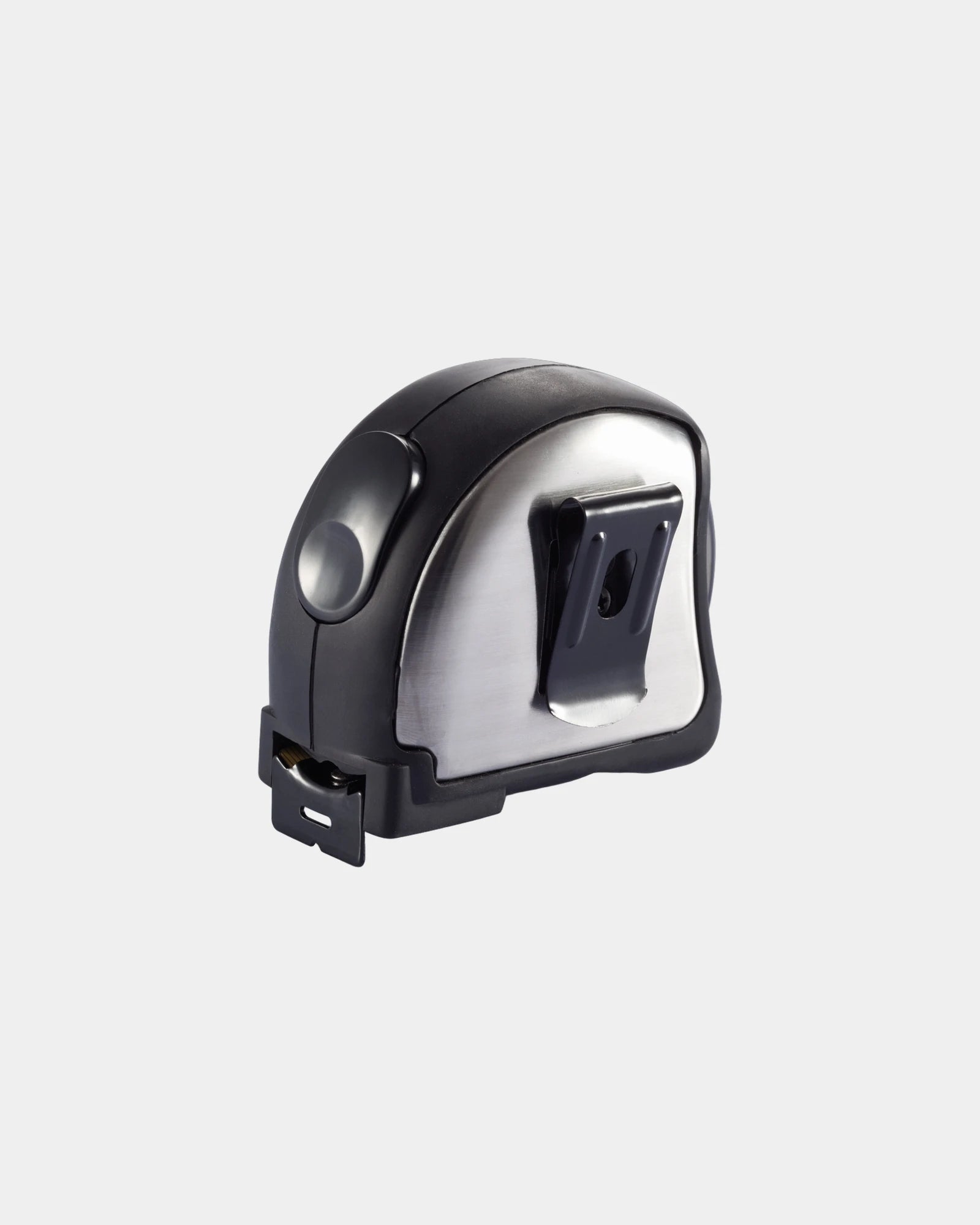
Promotional stainless steel tape measure 5m 25mm - 1Promotional stainless steel tape measure 5m 25mm - Silver
Starting from £7
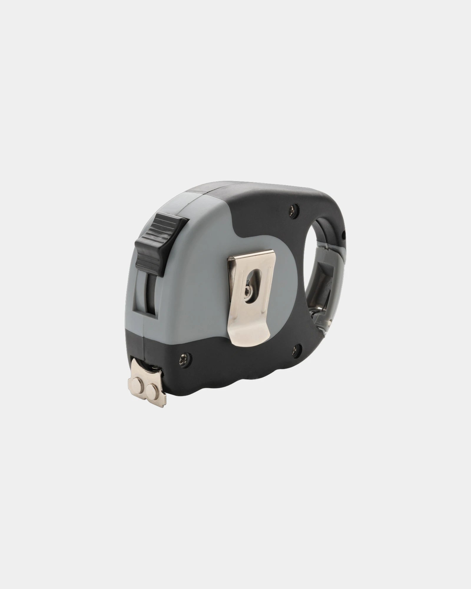
Promotional 5m Tool Pro tape measure - 1Promotional 5m Tool Pro tape measure - Grey
Starting from £5
  • Eco-friendly
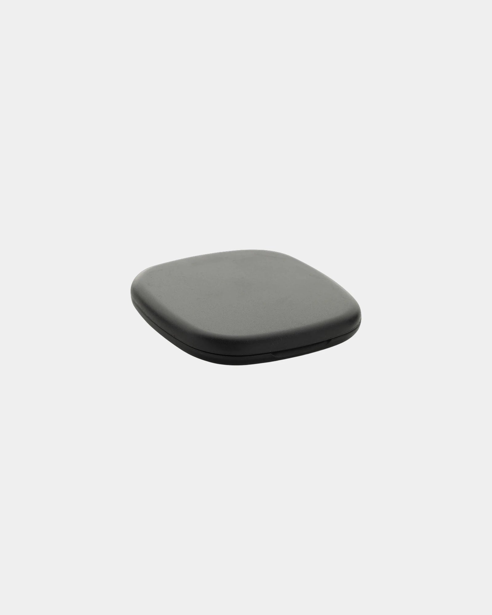
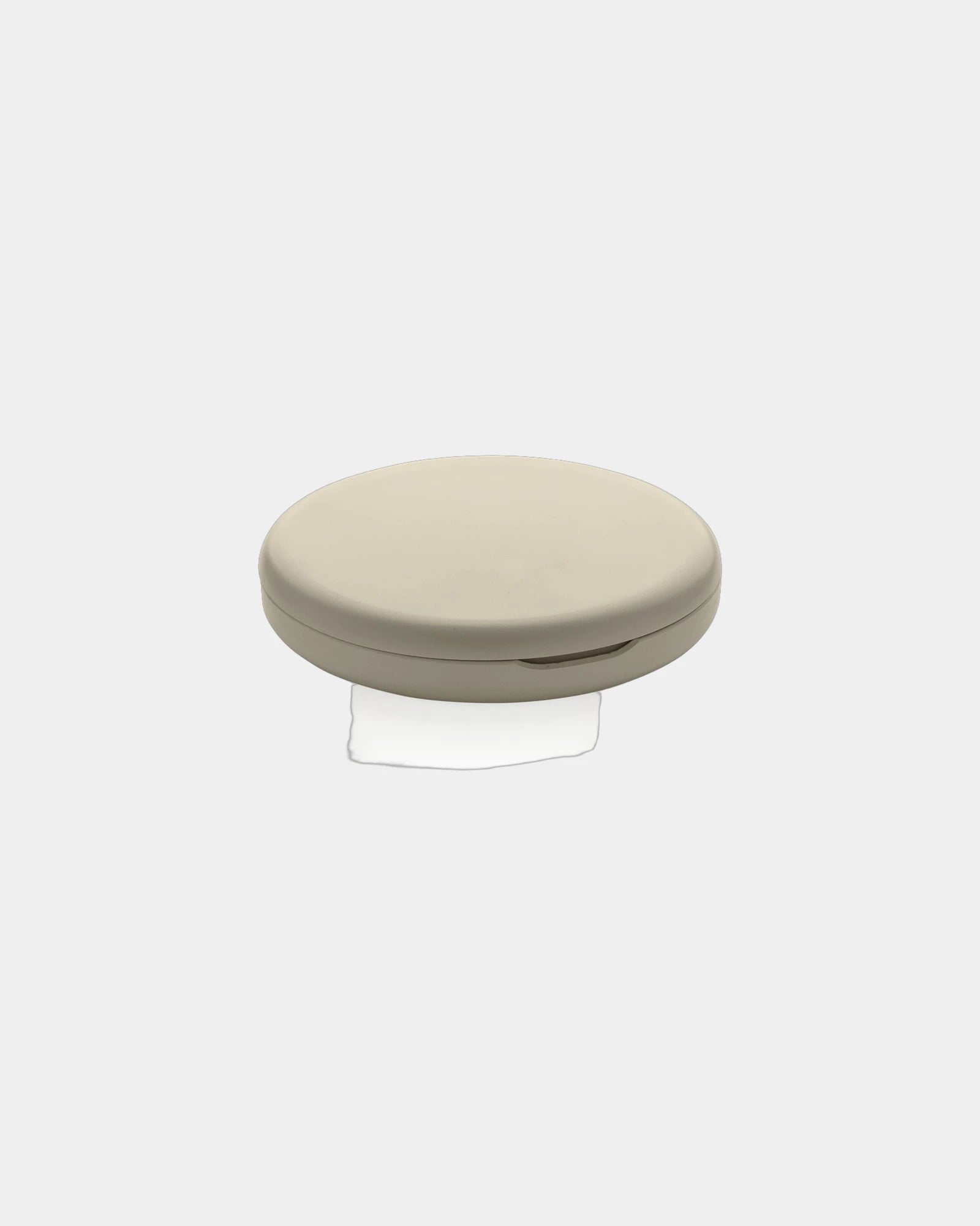
Custom recycled RCS pocket mirror with magnifying side - 1Custom recycled RCS pocket mirror with magnifying side - Black
Starting from £1
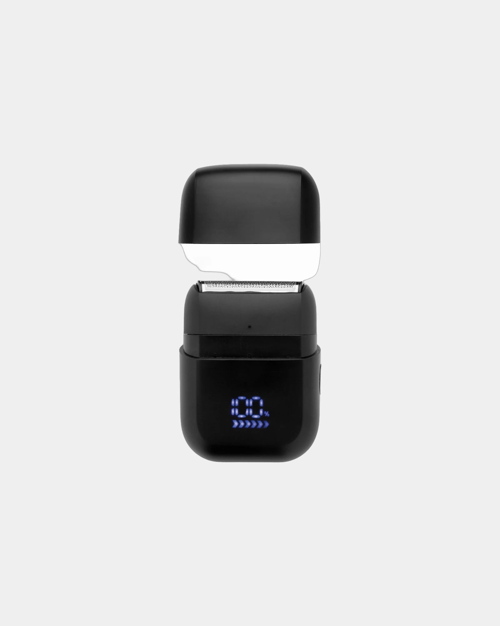
Promotional rechargeable IPX7 travel razor - 1Promotional rechargeable IPX7 travel razor - Black
Starting from £22
  • Eco-friendly
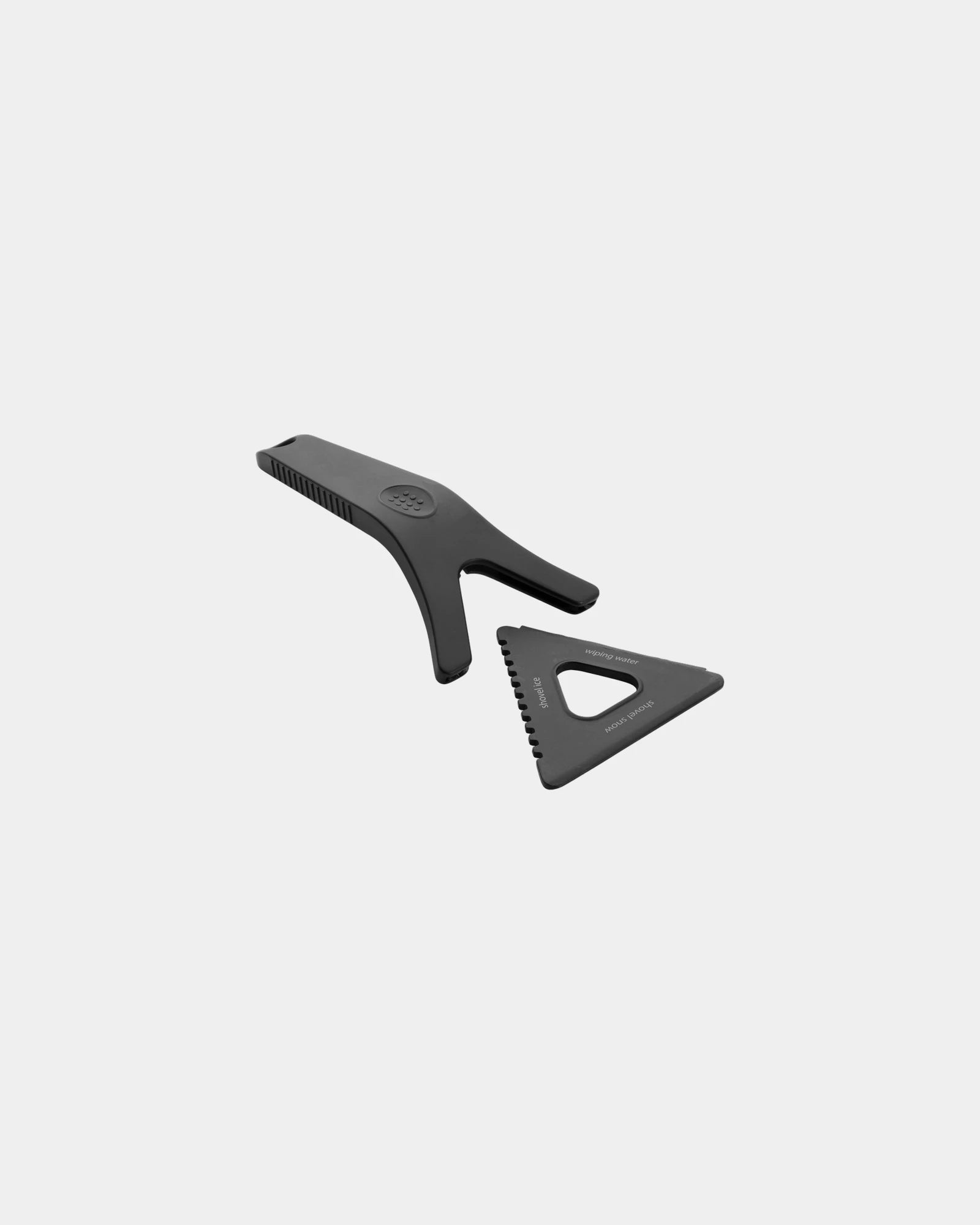
Custom recycled RCS 3-in-1 ice scraper tool - 1Custom recycled RCS 3-in-1 ice scraper tool - Black
Starting from £3
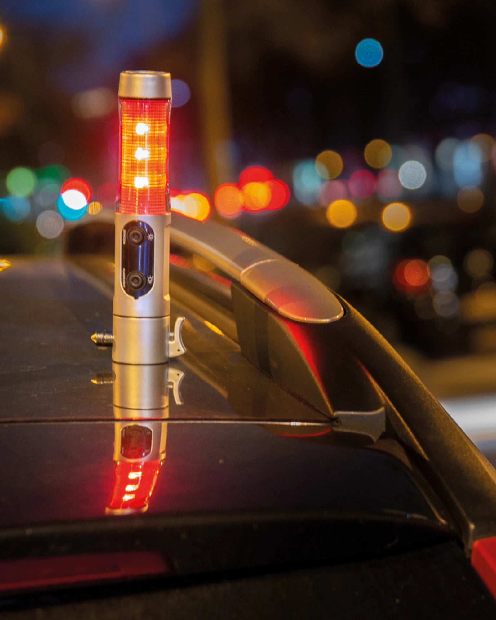
Promotional ABS emergency flashlight with magnet - 4Promotional ABS emergency flashlight with magnet - Silver
Starting from £9
  • Eco-friendly
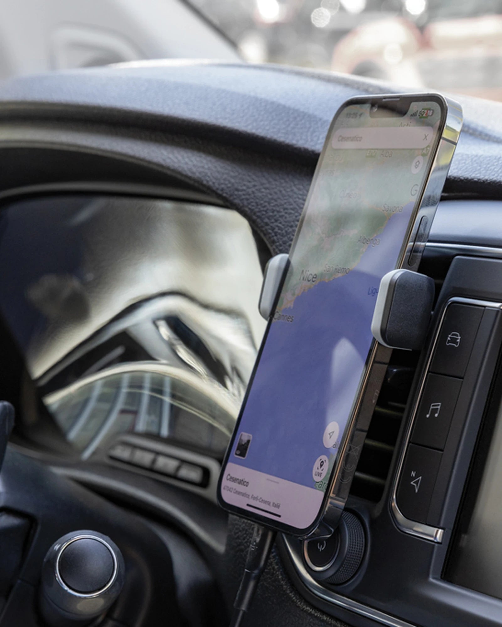
Promotional recycled ABS car phone holder - 4Promotional recycled ABS car phone holder - Black
Starting from £3
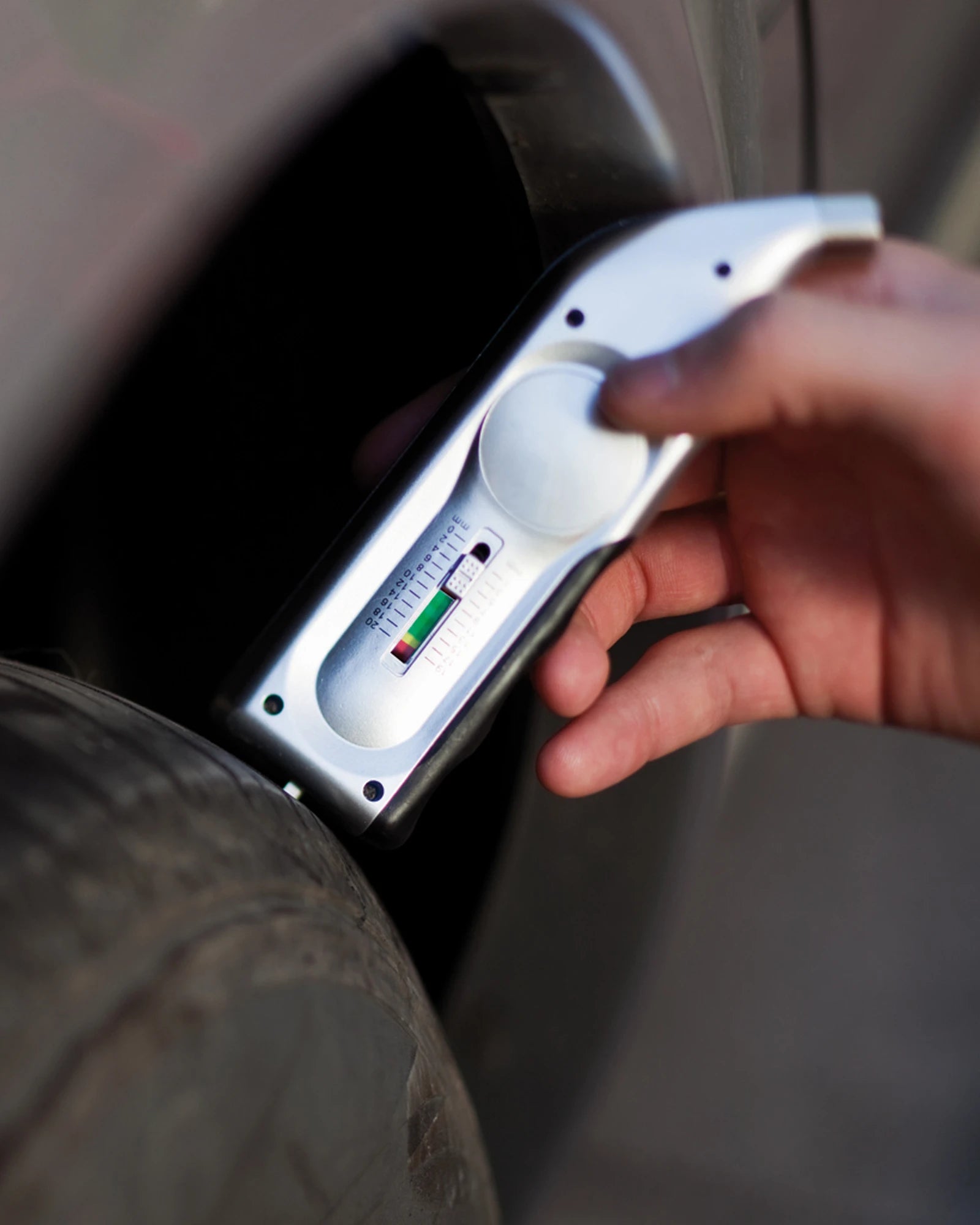
Promotional digital tire pressure gauge - 2Promotional digital tire pressure gauge - Silver
Starting from £7
  • Eco-friendly
Custom promotional first aid kit Vinga Baltimore - 1Custom promotional first aid kit Vinga Baltimore - Black
Starting from £8
+ 1
  • Eco-friendly
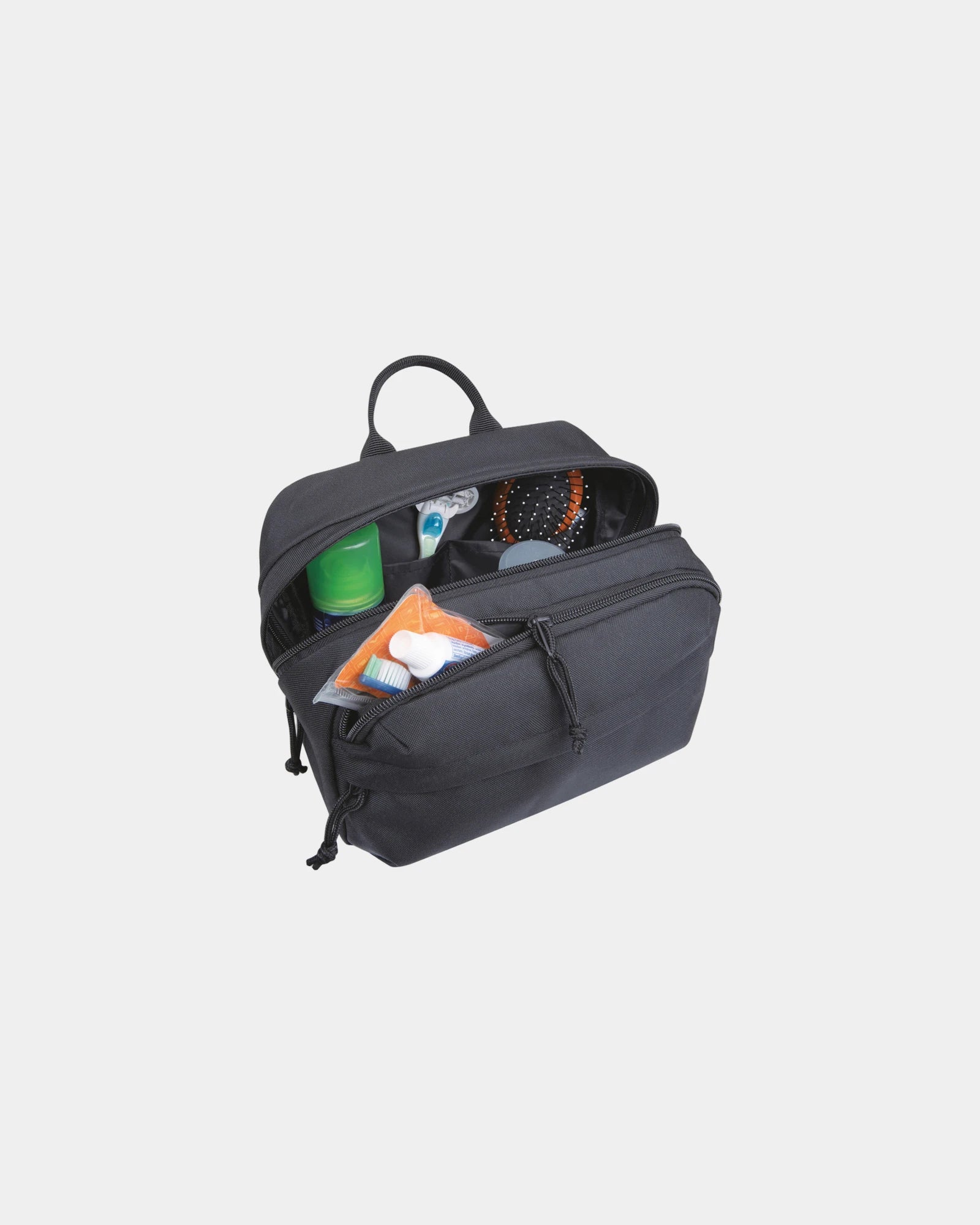
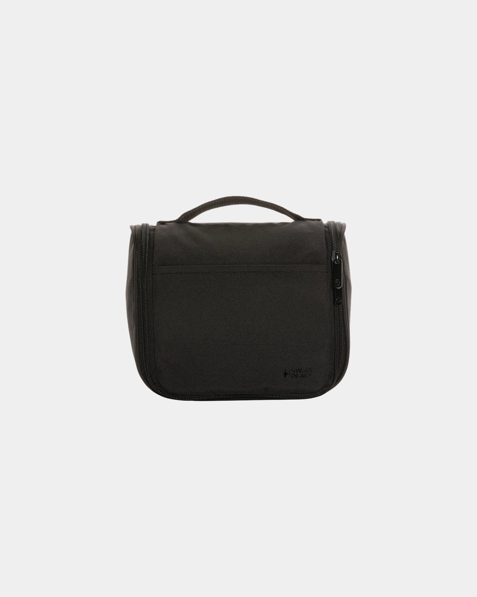
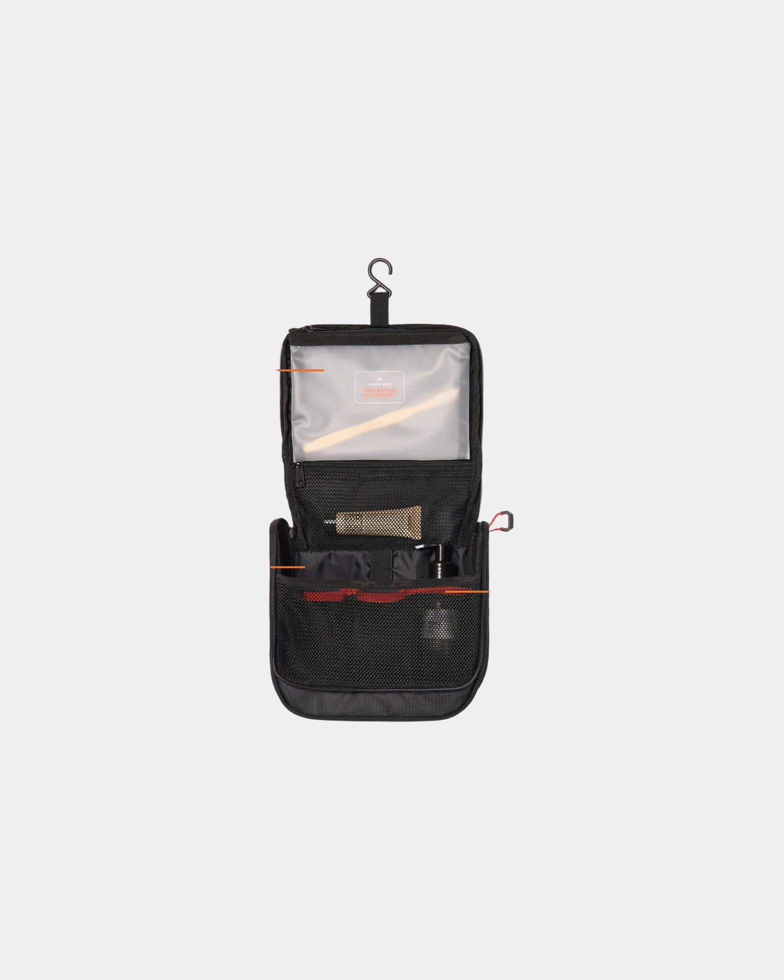
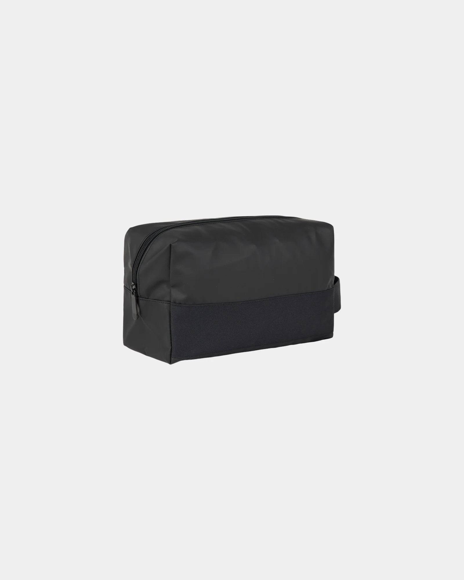
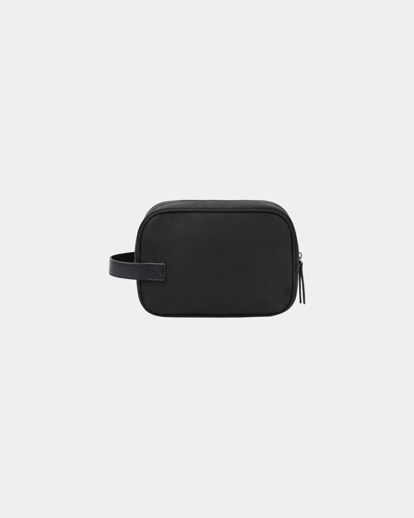
Promotional rPET travel toiletry bag - 1Promotional rPET travel toiletry bag - Black
Starting from £7
  • Eco-friendly
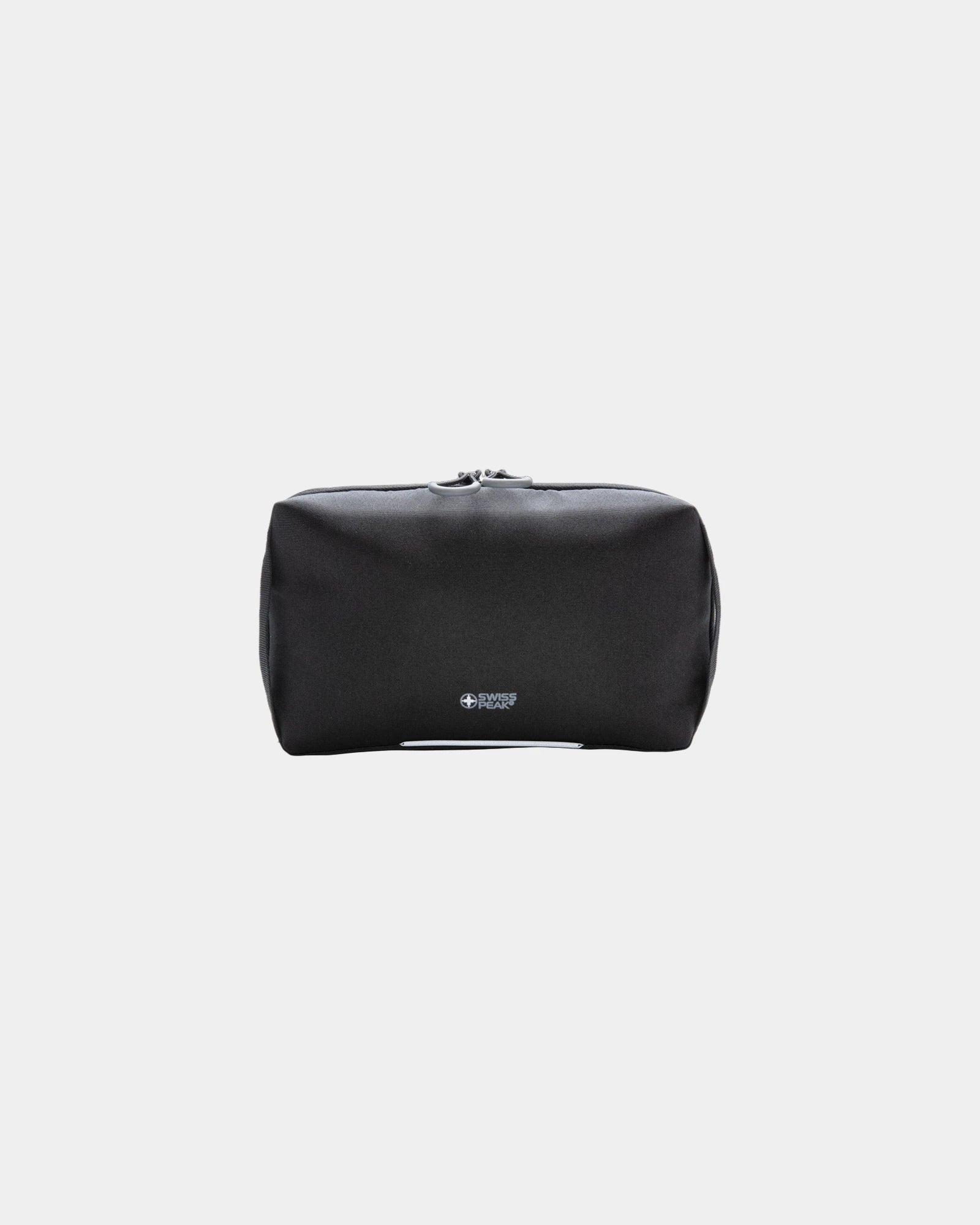
Promotional rPET AWARE™ travel toiletry bag - 1Promotional rPET AWARE™ travel toiletry bag - Black
Starting from £8
  • Eco-friendly
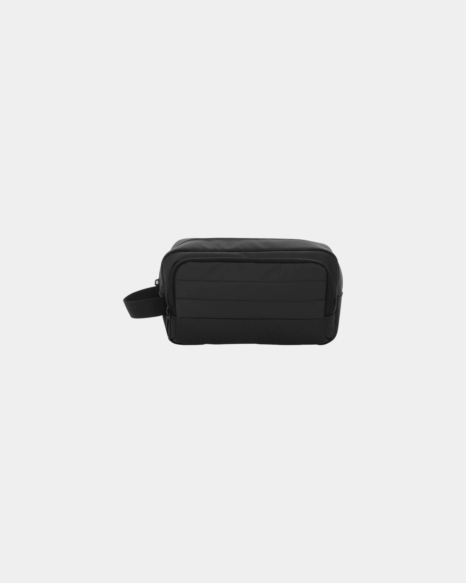
Promotional rPET travel toiletry pouch set - 1Promotional rPET travel toiletry pouch set - Black
Starting from £22
  • Eco-friendly
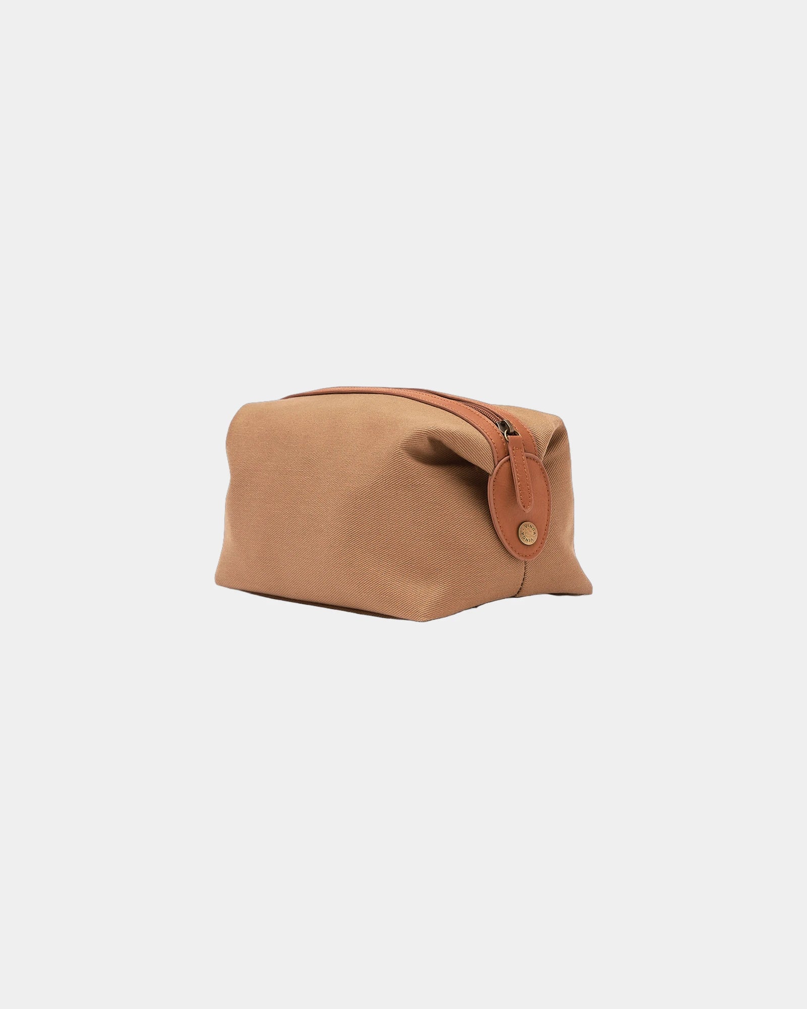
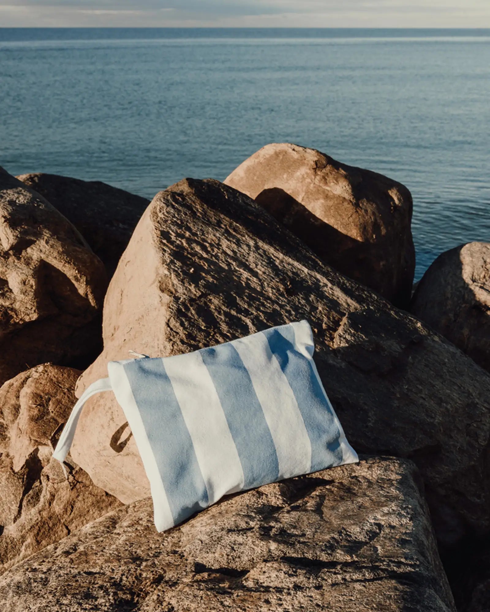
Custom recycled cotton toiletry bag Vinga Lagoa - 1Custom recycled cotton toiletry bag Vinga Lagoa - Light Blue
Starting from £4
  • Eco-friendly
Promotional rPET AWARE™ travel toiletry bag - 1Promotional rPET AWARE™ travel toiletry bag - Black
Starting from £8
  • Eco-friendly
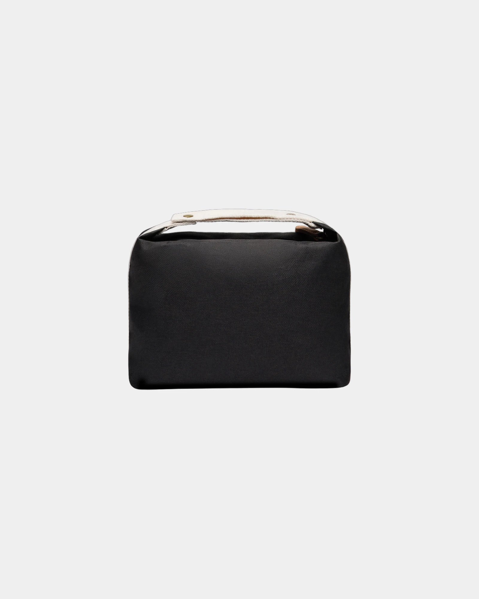
Promotional recycled toile travel pouch - 1Promotional recycled toile travel pouch - Off-White
Starting from £4
+ 1
  • Eco-friendly
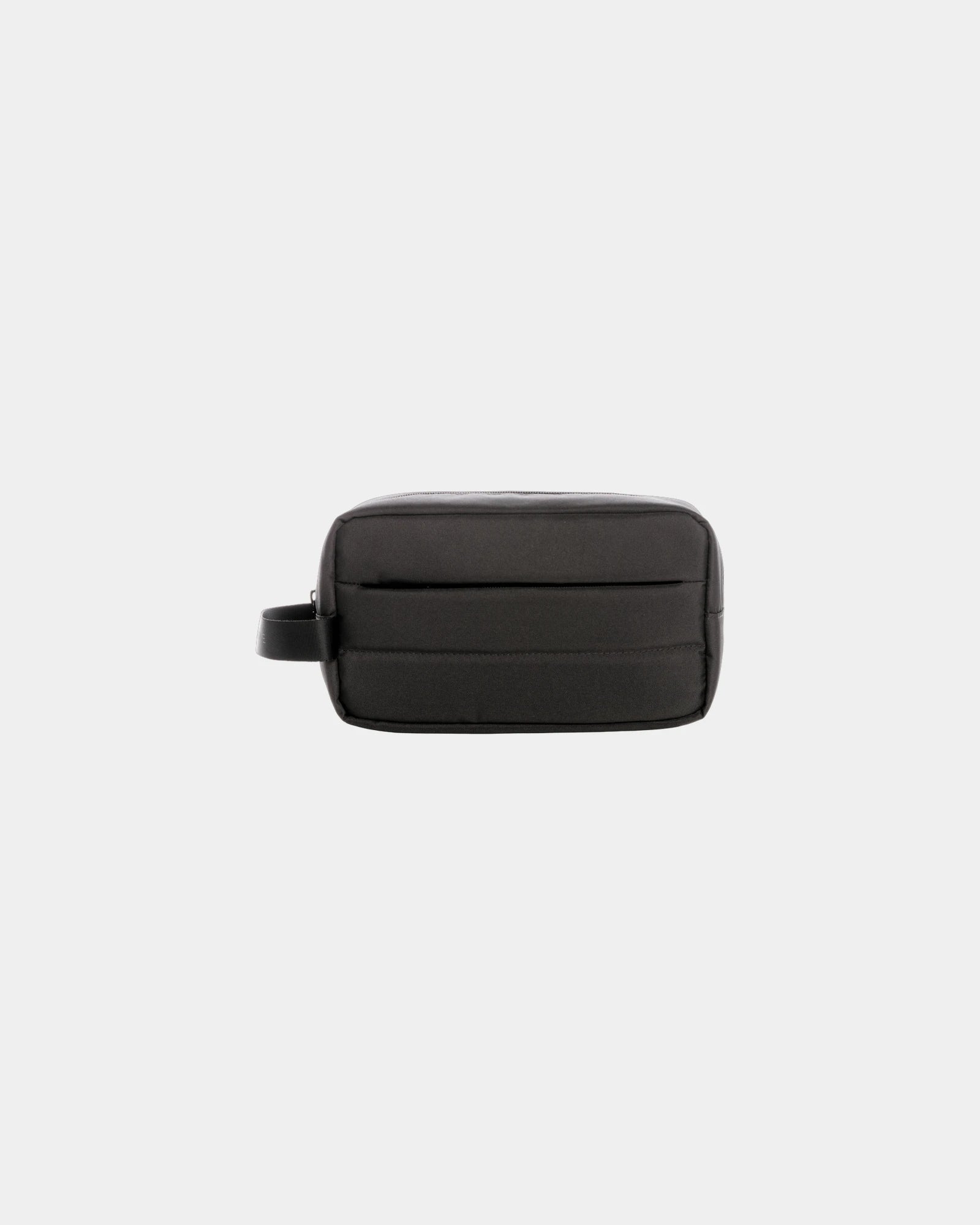
Custom recycled polyester travel toiletry bag Vinga Sortino - 1Custom recycled polyester travel toiletry bag Vinga Sortino - Black
Starting from £7
  • Eco-friendly
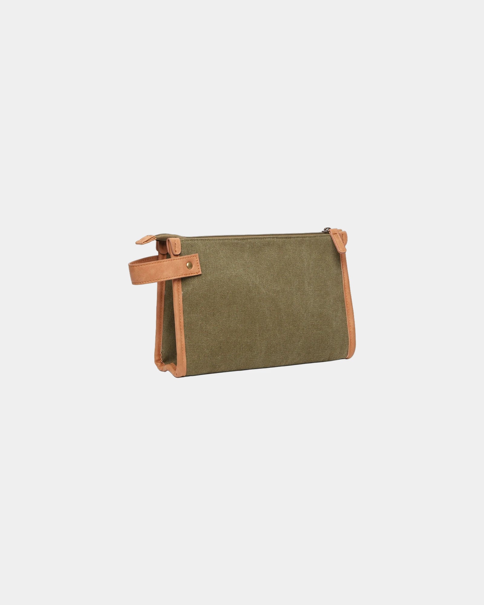
Custom recycled polyester travel toiletry bag Vinga Bosler - 1Custom recycled polyester travel toiletry bag Vinga Bosler - Green
Starting from £10
+ 1
  • Eco-friendly
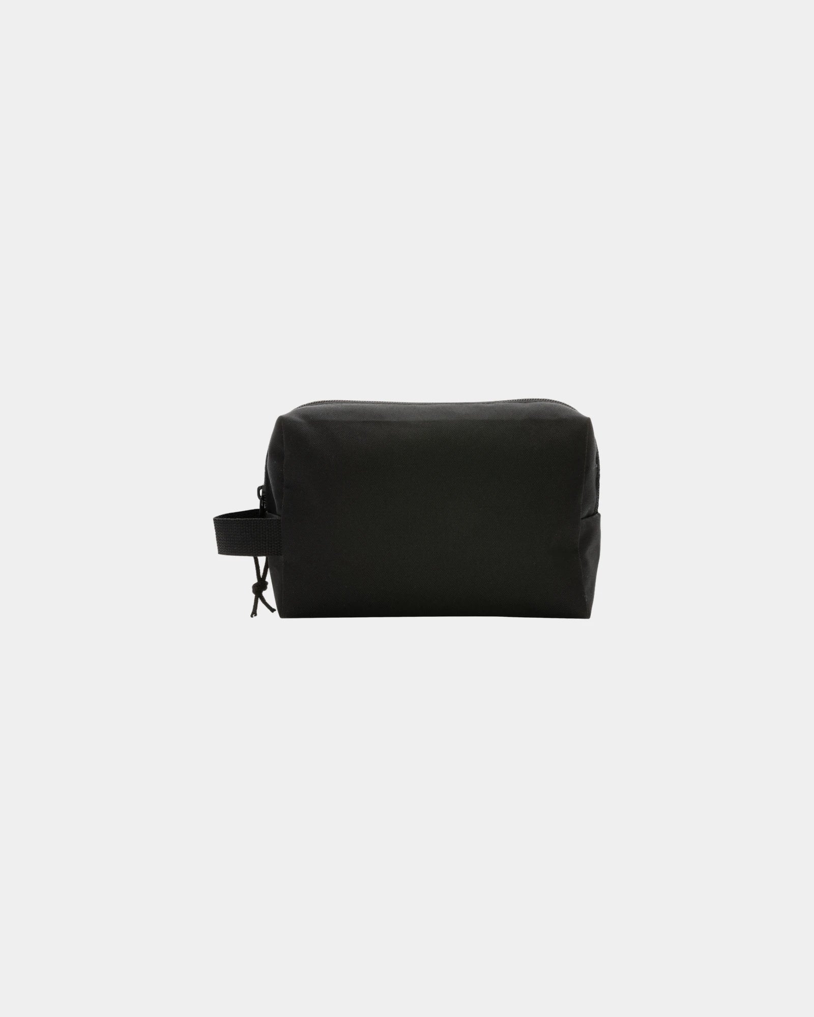
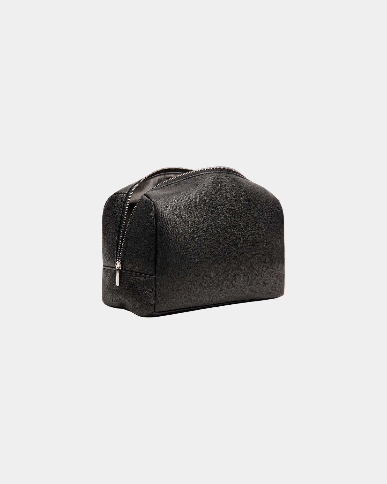
Custom recycled polyester toiletry bag Vinga Marlow - 1Custom recycled polyester toiletry bag Vinga Marlow - Black
Starting from £13
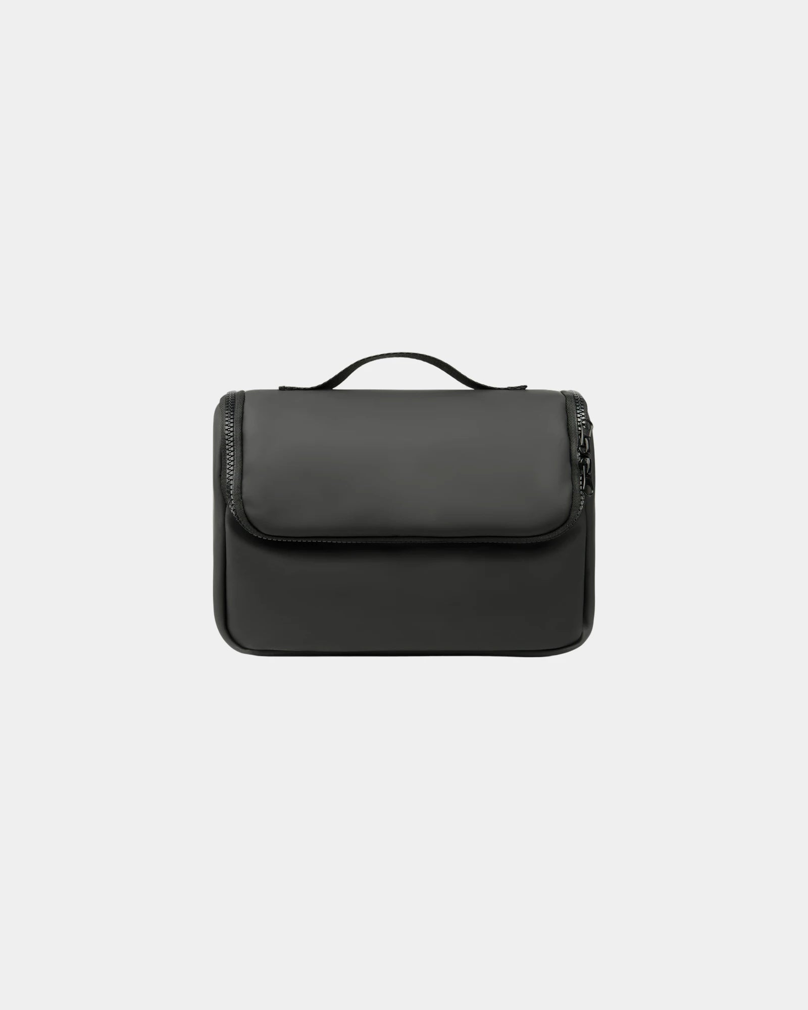
Custom waterproof toiletry bag Vinga Baltimore - 1Custom waterproof toiletry bag Vinga Baltimore - Black
Starting from £15
+ 1
Treat your clients and employees!

Rains

FAQ - Rebranding gifts

Trusted by 1,000+ companies

Rebranding merchandise: one master mark, identical across your whole range

Start here with the decision that sits above every product choice. When you refresh your brand, do you want one new mark that reads the same on every item, or are you happy for it to drift between batches? If it is the former, the control is a single approved master file feeding every line, not a fresh interpretation per order. That one decision is what this whole hub exists to get right, and it is what no single product page can settle for you.

Order the same new logo piecemeal across the months of a rebrand and small differences creep in between batches. A pen printed in March and a bottle printed in June sign off against different references, and the two slowly diverge in weight and tone. Lock one vector master and one colour set at the outset and every line reads from the same source, so the range holds together whatever surfaces it spans. The rest of this page routes that master down to the specific items it has to land on.

This page is an overview, not a place to order from. Each section below settles one part of holding your new mark consistent across a range, then sends you to the collection that carries that item's sizes and ordering detail. Decide the artwork, colour and version rules here, then pick the exact unit once you click through.

Running a rebrand rollout across your whole range

If you are mid-rebrand, this is the section to act on first, because a rebrand is where consistency stops being a nicety and becomes the launch. The new mark has to appear the same day across drinkware, wearables, stationery and bags, with no old-logo stock left contradicting it. The buyer decision is whether to run the refresh as one coordinated rebrand rollout or item by item, and one order is what keeps the launch tight.

Personalised mugs are usually first to date a rebrand, since a kitchen full of old-logo cups is the most visible relic of the previous identity. Refresh the everyday items first to buy the new mark its quickest wins, then cycle longer-lived kit through as old stock runs down. Sequencing the swap this way spreads the cost without leaving the brand looking half-changed in front of staff and visitors.

The artwork advantage of a single rebrand order is consistency at source. One approved vector master and one set of Pantone codes feed every line, so the new mark is the same whether it lands on a bottle or a notebook. That is the outcome a rebrand is paying for, and it is far harder to recover once a range has already been ordered in separate, unmatched batches over a year.

Getting the right artwork format for rebranding merchandise

Before you choose a single item, settle the file, because the format decides whether the new mark survives every surface it will later sit on. The buyer decision is simple: supply outlined vector or commit to redrawing later at extra cost. A vector file (.ai, .eps or print-ready .pdf) scales from a 6mm pen print to a 300mm back panel with no loss, and every decoration method reads from it cleanly.

Vector versus raster for rebranding merchandise

A JPEG or PNG pulled off a website is raster, fixed to its original size, and rarely sharp enough for a small mark. If you only hold a raster version of the new logo, it usually needs redrawing into vector first. We send a free artwork proof within 24 hours so you see exactly how your mark renders at the real print size before anything is made. That proof is where a too-thin stroke or an unreadable strapline gets caught and adjusted.

Outlining type matters as much as the format itself. A new wordmark set in a font you own but we do not will reflow on our system unless the text is converted to curves. Supplying type as outlines locks the letterforms exactly as designed, so a wordmark stays true on every item rather than shifting to a substitute typeface mid-range.

File typeWhat it isSuitsRisk on merchandise
.ai / .eps / .pdf (vector)Outline-based, scalableEvery method, every sizeNone if type is outlined
.svg (vector)Web vector formatPrint after conversionEffects may not carry over
.png (raster)Pixels, transparent groundReference onlyBlurs at small print size
.jpg (raster)Pixels, flat groundReference onlySoft edges, white box risk

Pantone matching: holding one colour across your rebranding merchandise

The colour decision to make once, up front, is which exact references everything matches to. Quote the Pantone (PMS) codes from your new brand guidelines and every item is matched to the same fixed ink recipe rather than guessed from a screen. Without that, a brand red drifts to orange on a bottle and to maroon on a tote, and the range reads as three different brands at a glance.

RGB to print colour on rebranding merchandise

Screens emit colour in RGB; print lays it down in CMYK or spot ink, and the two never line up by default. A bright on-screen blue often cannot be reproduced in standard four-colour print and needs a spot Pantone to hold true. Supplying your primary and secondary Pantone codes early spares the back-and-forth of approving a colour that was never achievable on that surface in the first place.

Material moves the target too, and a consistent range plans for that rather than ignoring it. The same Pantone reads warmer on natural cotton, cooler on white-coated metal, and darker on kraft card, because the base tone shows through the ink. We flag where a colour will shift on a chosen base, so your rebranding merchandise lands as close to the new brand reference as each material physically allows.

SystemWhere it livesRole in a merchandise orderWhat to supply
Pantone (PMS)Spot ink recipeThe matching target per itemPrimary and secondary codes
CMYKFour-colour printFull-colour artworkA CMYK build for wraps
RGBScreens onlyReference, never the targetHex for digital sign-off
HexWeb colour valueBrief reference onlyListed in brand guidelines

Choosing a full or reduced mark per item of rebranding merchandise

The recurring decision across a range is which items carry your full mark and which carry a reduced one, because no single version fits every surface. A detailed primary logo that reads at 40mm on a notebook turns to mush at 15mm on a pen barrel. Settle the hierarchy in advance and the range looks deliberate; leave it per-order and the pieces drift apart when they sit together on a desk.

Reduced marks for small rebranding gifts

Most brands already hold a stripped-back secondary asset, a logo-only lockup or a monogram, and the smallest items are exactly where it comes into use. A new wordmark with fine serifs or a long strapline often will not reduce cleanly. A one-colour simplified version then carries the brand at micro scale far better than a squashed full mark. Deciding this once, range-wide, is part of locking the master rather than a per-item afterthought.

How that logo physically meets each surface, the method that suits ceramic versus coated metal versus cotton, is a question this hub deliberately leaves to the wider catalogue. Promotional products sets out marking method by material across every family in one place. Here the concern stays narrower: which version of the mark you supply, so it stays recognisably yours whatever method the chosen item later uses.

Logo placement and sizing across your rebranding merchandise

Placement on your rebranding merchandise is a design decision you make once for the whole set, not a default the factory picks per item. The buyer call is the position and mark version for each surface, settled before any item is chosen. A logo centred small on a tote front looks lost; scaled to a sensible share of the panel it commands the bag. On a mug the print sits opposite the handle for a right-handed user, so the mark faces out while the cup is held.

Personalised notebooks show how placement style shapes the read of the same mark. A cover can carry a blind deboss, a metallic foil or a printed mark, and each suits a different weight of branding. A discreet debossed mark reads as considered; a foil block reads bolder. Matching the placement style to the item keeps a range coherent without making every piece shout at the same volume.

Holding a fixed position across a category is the small discipline that makes a set photograph as one brand. A left-chest mark at a standard size and height reads as uniform across body sizes; a back print is for event visibility. The table sets out the usual position and the right mark version per item, so you can lock placement range-wide rather than negotiating it order by order.

ItemUsual positionMark versionWhy it works
Tote bagCentred on front panelFull mark, largeReads from a distance
MugOpposite the handleFull mark, mid-sizeFaces out when held
Polo or teeLeft chestReduced or logo-onlyUniform across body sizes
PenAlong the barrelOne-colour or monogramSurvives the narrow width
NotebookLower-front coverDebossed or foil markConsidered, not loud

Keeping rebranding merchandise consistent across a mixed order

When your rebranding merchandise spans several surfaces in one order, the decision is who controls the reference, and the answer is a single artwork master shared across every line. The risk otherwise is that a pen printed one week and a bottle printed the next drift apart in colour or proportion. A locked Pantone reference shared across the whole order is the control that holds the pieces together, whatever materials the run mixes.

We hold your approved artwork and colour build on file once a master is signed off. A top-up or a new item six months on then matches the original batch rather than starting from a fresh interpretation. That continuity is what lets a brand add to its merchandise across a year without the early and late pieces looking like two different identities sitting side by side.

Deciding the version hierarchy in advance is the other half of the control. Which items carry the full mark and which drop to one colour should be a plan, not a surprise at proof. Set that once and a mixed order of drinkware, wearables and stationery reads as one deliberate range rather than an accidental assembly of whatever each factory defaulted to.

Putting one consistent mark on staff and event rebranding gifts

For apparel the decision is how the mark holds up to wear and wash while still matching the rest of the range. The reproduction has to survive a season of use, not just look right out of the box. A screen print sits on the surface in flat solid colour; embroidery stitches the mark in for a raised, durable finish that suits a polo or a cap. Both must still match the master the bottles and pens were printed from.

Custom T-Shirts carry a mark across a chest or a full back panel, and the garment colour decides the ink approach. A light logo on a dark shirt may need an underbase white layer to stop the fabric muddying the colour. A multi-colour mark on a deep ground is where artwork and shirt colour have to be planned together, so the brand red still matches the bottle in the same order.

Placement on apparel follows convention so a team reads as uniform. A left-chest mark at a standard size and height keeps every garment consistent across body sizes; a large back print is for impact and visibility. Holding the same chest position and the same approved mark across every garment in a staff order is what makes a team photograph look intentional rather than assembled from leftovers.

Holding your new mark legible on the smallest rebranding gifts

On the smallest items the decision flips from placement to survival: will your new mark stay legible, or does it need its reduced version? A pen, a sticker or a notepad carries the brand onto thousands of desks, but at print sizes far smaller than any garment or bottle allows. The full mark rarely survives that, which is precisely why the version hierarchy you set earlier matters most down here.

Personalised pens are the tightest test of a rebrand rollout, since a pad print on a curved barrel offers only a narrow window for the mark. A busy logo with fine serifs or a long strapline often has to drop to a clean one-colour version or a logo-only lockup to print sharply at that width. The simpler the mark, the better it survives the smallest surface in your range.

Where a new mark will not reduce cleanly, a monogram or an initials lockup carries the brand at micro scale better than a squashed full mark. This is the secondary asset most companies hold but rarely deploy, and the stationery tier is where it comes into its own. Supplying it alongside the master means the small items match the big ones rather than improvising a cramped version on the day.

Anchoring rebranding merchandise where an item gives room to run large

At the other end of the range the decision is which item carries the full mark at full size, and a bag usually wins that role. A wide front face lets your new mark run large and read from a distance, with room for a strapline or secondary lockup a pen could never hold. Naming the bag as the range anchor sets the reference the smaller, reduced marks then sit against.

Personalised Tote Bags take a screen print across a broad panel, and the cotton weight changes how crisply the ink sits. A smooth standard-weight cotton holds fine detail; a coarse heavy canvas can soften thin lines, so a chunkier treatment suits the heavier weave. Matching the artwork weight to the fabric keeps the anchor mark sharp rather than fuzzy at the top of your range.

Set the bag against the bottle and the pen from the same order and the rebranding merchandise hierarchy shows itself. Full mark large on the bag, mid-size on the drinkware, reduced on the small surfaces, all drawn from one approved master. That visible ladder, anchored on the item with the most room, is what reads as a controlled identity rather than a set of unrelated prints.

The proof stage: signing off your rebrand rollout in one pass

The proof is the single checkpoint where an error on your rebrand rollout is still cheap to fix, and the decision is whether to sign the whole order off in one pass. Once a screen is burned or a thousand barrels are printed, a misaligned mark or a wrong Pantone is a reprint, not an edit. The proof shows your new mark at the real print size and position for each item, which is where a stroke too thin or a colour off-brief gets caught.

Read the proof for the things a monitor hides. Check the mark is centred where you expect, the colour codes match your guidelines, and small type stays legible at full size. A proof that looks fine shrunk on a screen can reveal a problem at the finished scale. That is exactly why each one is sized to the piece rather than the page it is viewed on.

Across a mixed order, one proof can hold every line at once. You sign off the bottle, the pen and the tote against a single set of brand rules in one pass. There is no chasing colour and placement item by item after production starts. That single approval is the practical expression of the one-master principle the whole hub turns on.

Sequencing your rebrand rollout by tier

A rebrand rollout rarely launches in one drop, so the decision is the order in which the tiers go out. Everyday items date a brand fastest and earn the quickest wins, so they lead. Wearables follow as a staff intake refreshes. Premium gifts and long-life kit cycle through last, as old stock runs down. Sequencing the master mark this way spreads cost without leaving the brand half-changed.

Map the rollout to how visible each tier is to the people who matter. A kitchen of old-logo mugs contradicts a rebrand in front of every visitor, so it goes first. A back-office stationery drawer is seen by fewer eyes, so it can wait for a natural reorder. Each tier reads from the same locked master, so an item sent in March still matches one sent in September.

Budget split across the tiers usually beats one even spend. Put the deepest decoration on the premium gifts that named clients keep, and route the simplest one-colour mark to the high-volume stationery. The table below pairs a common rollout tier with the timing and mark version that tend to suit it best.

TierRollout timingMark versionWhy it leads or waits
Everyday drinkwareFirst waveFull mark, mid-sizeMost visible relic of the old logo
Staff apparelSecond waveReduced, left chestCycles with a hiring intake
Event giveawaysOn demandFull or reducedTied to a dated activation
Premium giftsAs neededFull mark, deep finishLow volume, high value
StationeryNatural reorderOne-colour or monogramLeast visible, longest stock life

Get the sequence right and the new mark lands consistent from the first wave, because every tier draws from one approved master rather than a fresh interpretation per batch.

Briefing your rebranding merchandise for an accurate first quote

To turn an enquiry into a costing without a chain of emails, decide what to send up front. That means a vector logo, your Pantone codes, and the items and quantities in mind. With those three, the decoration method and any artwork adjustment come back named, so you know early whether a mark needs simplifying for the smallest surface in the run.

Supply the highest-quality logo you hold, even a raster file, and we will say plainly whether it redraws cleanly or needs rebuilding into vector first. A mark lifted from a social-media post often needs redrawing before it prints crisply at a small size, and hearing that early avoids a soft result on finished stock. The free 24-hour proof then shows the real outcome before you commit to a volume.

Any recycled or organic content is a per-product figure, printed on that item's own spec sheet for the precise base you choose. The OEKO-TEX or recycled-cotton status for a tote, for instance, is tied to that exact fabric and shown on its tech pack. So any figure you quote to your own audience reads off the product you ordered, never a range-wide label applied across the hub.

  • Lock one outlined-vector master to feed every line in the range
  • Quote your primary and secondary Pantone codes from brand guidelines
  • Decide which items carry the full mark and which a reduced one
  • Hold a one-colour or monogram version for pens and small surfaces
  • Keep left-chest placement consistent across a staff apparel run
  • Refresh everyday items like mugs first when the brand changes
  • Approve the free 24-hour proof across the whole order in one pass